Lead UX Designer, Design System
TOPdesk
2022 – 2026 · Budapest
I joined TOPdesk in 2022 as a UX designer on a product team. The company had just started a design system team, strong on engineering but thin on design, with no design leadership. My team was already doing semi design-system work, and since I'd owned a design system before at Vodafone, I stepped up as design lead when the two teams merged into one.
That leadership was the piece that had been missing. TOPdesk had tried to build a shared system before and failed more than once. The company is very engineering-heavy, so designers rarely came from the lead side, and every earlier attempt had died the same way, with nobody steering the design.
Working with the PO, I put the foundations down: Atomic Design as the approach, and the basics a system needs before it can start, the grid, the spacing system, the underlying principles, with accessibility built into the components from the start rather than added later. From there we built a roadmap, balanced against what teams needed right then.
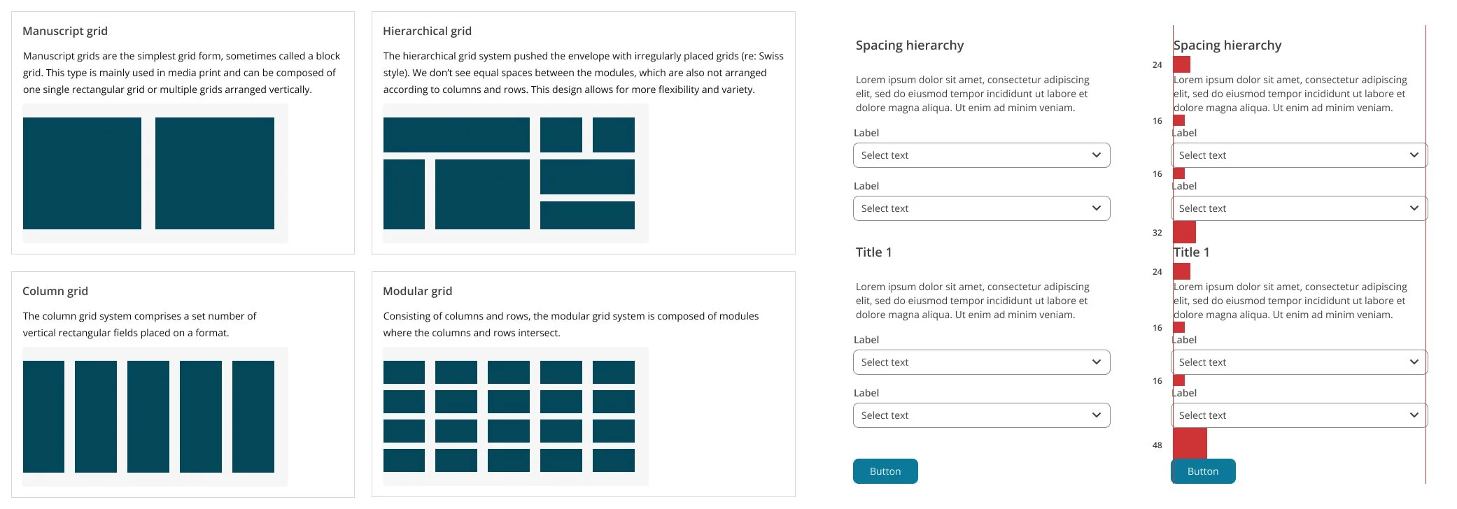
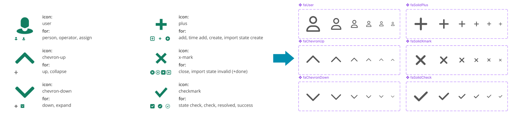
Icons were an early fight. Before the DS every team kept its own, so the company had four different pen icons floating around, among others. Rather than draw a library from scratch, which would take forever and pull us off the real work, we bought FontAwesome and let the rollout do the work: the new icons went into the DS components, so adopting the components moved you onto the new icons for free. Anything missing could still land in the library through a request channel I set up. I owned this end to end, sourcing or drawing whatever wasn't there and running the Figma side while the architect handled the code.
The system was never mandatory, and that mattered. TOPdesk had a flat, horizontal structure and the earlier attempts had failed, so we had to win teams over rather than order them in. The PO made the case across the organisation, and I worked with the design community directly, running one-on-one sessions with the team designers. Those weren't only about using components. I used them to help designers grow, better page structure, more modern flows, stronger product thinking, and that mentoring made the DS land better as a side effect, because designers who think in flows adopt a system more readily than ones who think in screens.
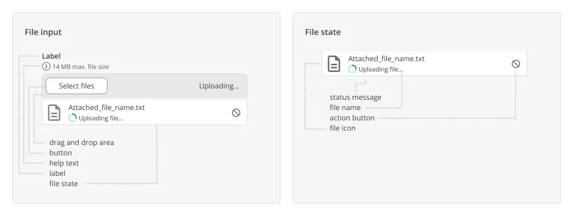
Designers and engineers worked closely the whole way through. It was never a handoff where I finished a design and passed it over to be built, but a back-and-forth about what was possible and how to make it better, from both sides. A shared naming language across design and code meant a component meant the same thing to a designer and a developer, which took a lot of friction out.
The clearest sign it was working was how people talked about it. Early on the question was whether to use the DS at all. Over time that turned into "I'll use the component, but it needs to handle this case." The argument had shifted from whether to adopt the system to what the components should be able to do, and once most of the talk was feature requests, I knew we were fine.
By the later stretch most components were done, so we moved from making components to pattern work, composing good flows from the pieces we had. The filtering pattern is one of these, written up as its own case study. Along the way I hired and grew the team too, bringing in a senior and a medior and developing a junior, alongside coaching the designers on other teams.
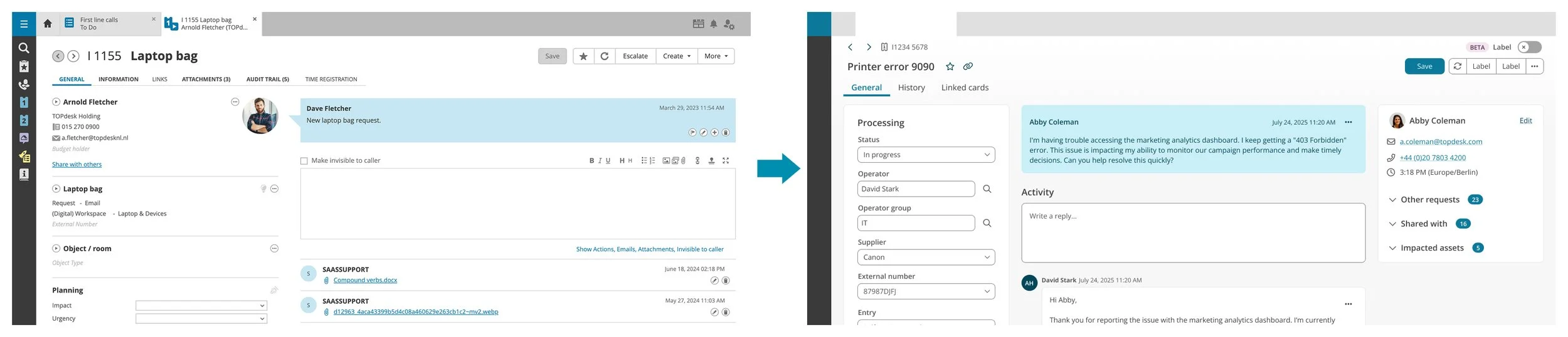
In 2025 the company committed to bringing AI into the product, and the design system was one of the directions that came out of it. We already used Figma Make day to day, so it was natural to push on what more it could do. I led that side while our architect led the Claude Code side, each of us needing the other's expertise. Figma Make turned out to be excellent for prototypes and mockups that look like the DS, ideal for reviews and user testing, but underneath it rebuilds everything as its own React, so it only looks like the DS and can't build real pages. Claude Code was the opposite, working against the real code base but needing coding knowledge most designers didn't have yet. We landed on a split: Figma Make for quick mockups and testing, Claude Code trialled one-on-one with willing designers.
By the time I left, the thing that had failed before was simply how the company worked. Anything new, a small update or a whole module rebuild, used the DS components, icons and patterns as the default instead of each team inventing its own. A system that had collapsed for want of design leadership every time before had become the norm, and it was in good shape when I moved on.
Download the more in-depth TOPdesk Design System case study here.