Global Filtering Pattern Case Study
One filtering pattern, adopted across the product suite.
Role: Lead UX Designer, Design System
Timeline: 3 months
Impacted: Asset Management, Incident Management, Action Management, Taskboard, Knowledge Base
Problem statement
The system is built module by module in a cell-based team setup, and each module ended up handling filtering its own way. Complexity needs vary too. Knowledge Base only needs a basic filter - users narrow down articles by a few criteria like active/archived, SSP (Self-Service Portal), or language. Asset Management is the opposite case, with thousands of entries in a data table where users need to build their own filter set from a long list of options.
We'd had complaints that the modules felt disconnected. Similar actions looked different and behaved differently depending on where you were.
Summary: create a filtering pattern that's easy to use, holds up at both small and large scale, and works the same way across every impacted module.
Approach
The first thing I did was gather the different use cases from the impacted teams, and I also surveyed the other teams to see if they planned to use filtering in the future, so those needs could be considered too. The conclusion: every team that needed filtering already had some solution in place. The one exception was Taskboard - they had basic filtering today but wanted to move toward something closer to Asset Management, where users build their own filter set from a list of options.
So the plan was to work closely with three anchor cases across the complexity range: Asset Management at the most complex end, Knowledge Base at the simplest, and Taskboard in between, mid-transition from simple to advanced.
Next was a competitor analysis - how other companies in our segment handle filtering. ServiceNow, Zendesk, Freshdesk, and Jira were a good place to start; I drew inspiration from several of them. I even tried building on ServiceNow's approach, but ended up going a different direction.
Alongside that, I looked at current trends for how modern filtering should work, drawing on sources like NNG (Nielsen Norman Group) and Medium, and did accessibility research with our team's A11Y specialist.
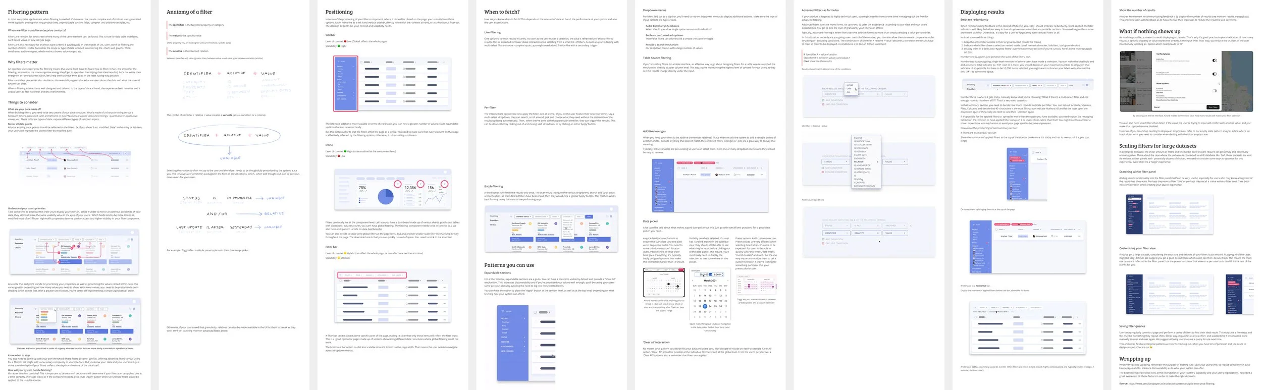
Design and iteration
I started with one top-down layout. Filters along the top, data underneath. The idea was that simple modules get a couple of dropdowns or toggles, and complex ones get a filter builder in the same top area. I'd looked at how can be done advanced filtering in top position and built something similar, an area where you add rows and put together a filter set from scratch.
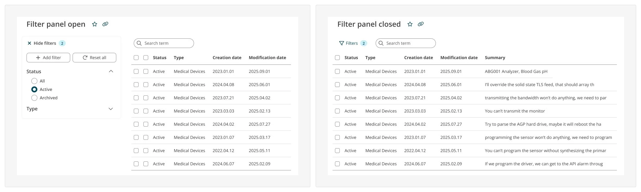
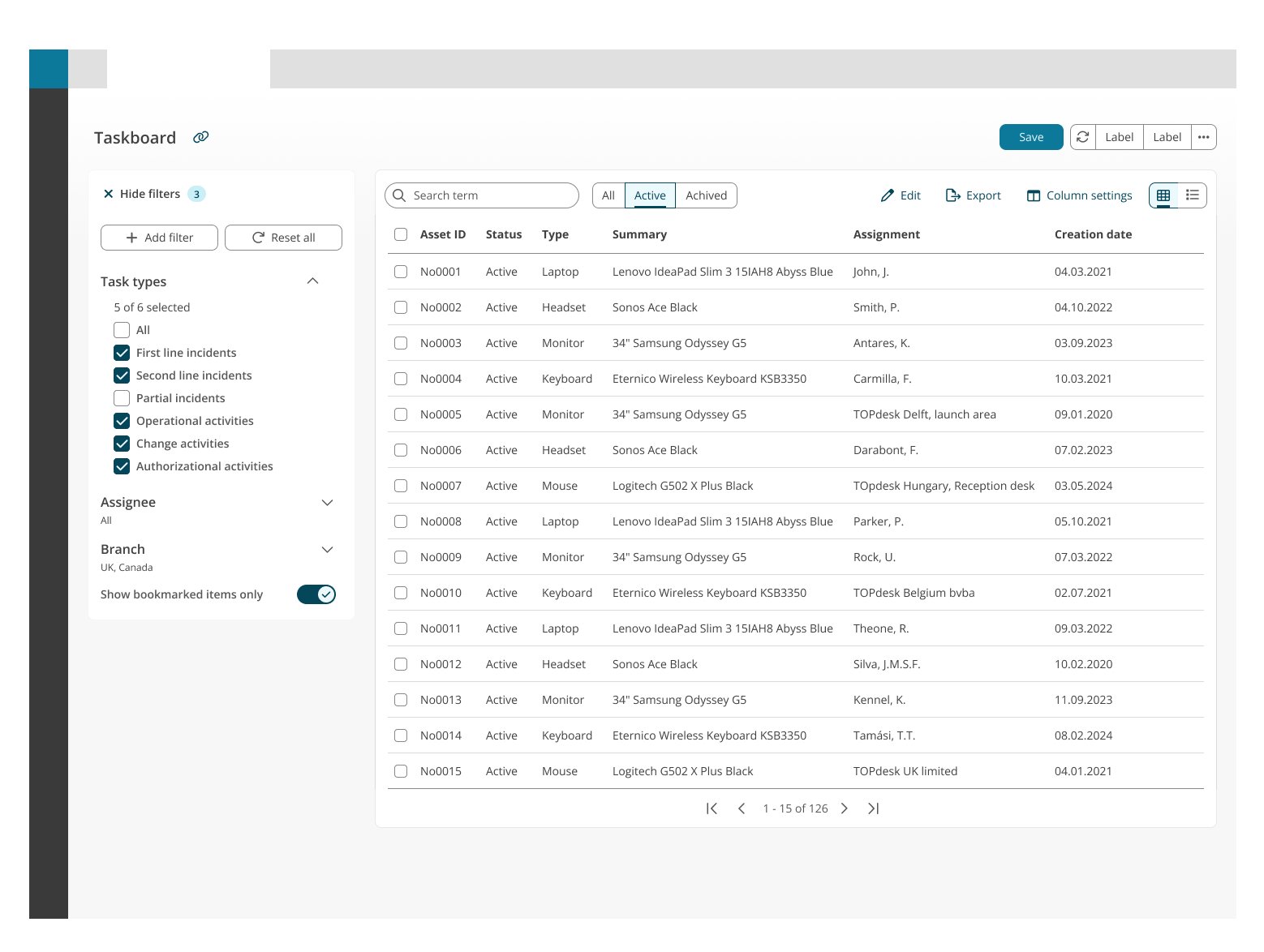
The "Filters 2" count does more than it looks. It tells you something is filtering the data even when everything's hidden, which is the exact moment you'd otherwise be looking at a table wondering where half the rows went. Same thinking as the inline labels up top: whatever state the UI is in, you can see what's applied. There's one rule behind that too. Each filter lives in one place and one place only, never in two, so you never have to guess which version is the real one.
Taskboard, the module that broke the first design, ended up being the best example of the final one. Quick toggles up top for fast filtering, the advanced panel next to it for the built-up set. Both at the same time, without fighting for space, because each one is where it should be. They're different filters, not the same filter twice, so it still follows the one-place rule.
Testing
Once the pattern was solid enough, I put it in front of real users. I ran a test on Useberry with just over 70 people, mostly application managers plus a mix of service and servicedesk roles, so people who actually filter data as part of their job.
I built two prototypes, one for each end of the pattern. The first was a simple one: filter a Knowledge Base search result down by a few things like status and language. The second was the Asset Management case, where you filter a data table but also add a new filter to the set and filter by that too, so the heavier build-your-own-set flow got tested as well. Each session started with a couple of questions about the person's role, then asked how the filtering felt while they used it, and ended with an open box for anything else.
The results backed up the two-state idea. Standard filtering did well, around 84% rated it satisfied or very satisfied and almost nobody was unhappy. Advanced came out a bit lower at about 73%, which is roughly what I expected. The simple end was always going to be the easy win, and the complex end was where any friction would show.
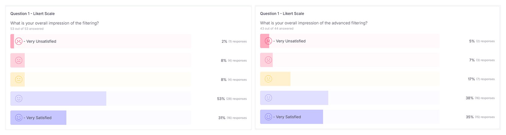
The comments were the useful part. On the standard side people mostly liked how fast it was to pick up, with small notes like making Clear all easier to spot. The advanced side is where it got poked at properly, and the complaints weren't spread out, they landed on a few specific things.
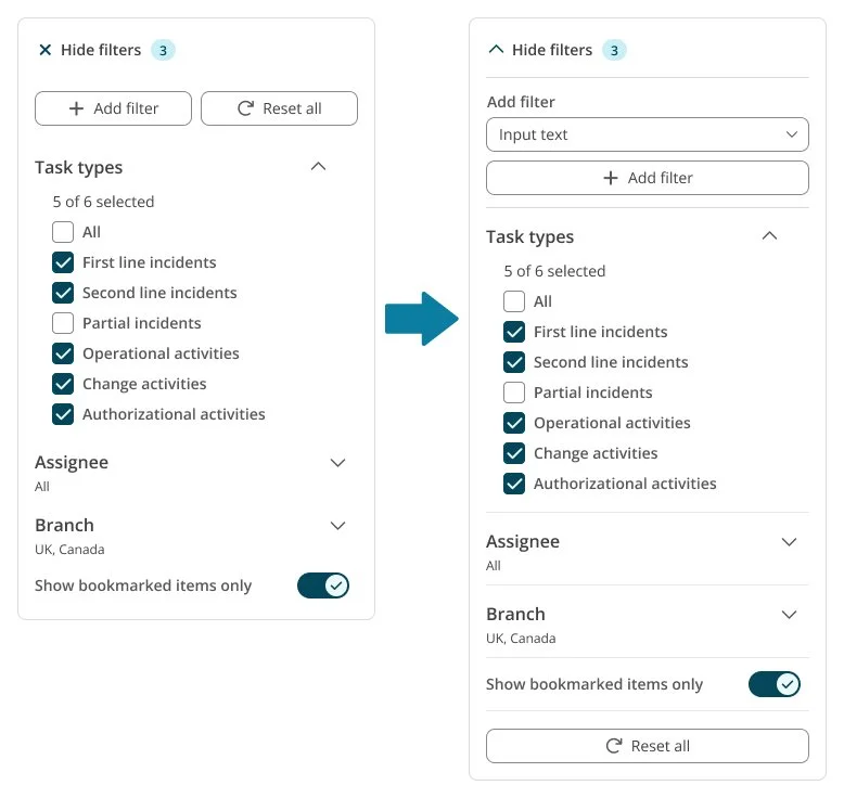
The main one was the collapse. A few people said hiding the panel with an "X" didn't read right. One thought it might mean turning filtering off completely, someone else said it made them second-guess whether they'd done the right thing. That was a problem with the affordance, not the idea, so I changed it. The panel now collapses with a chevron up into the top filter invoker instead of an X, so it reads as putting the filters away rather than closing them.
A couple of people also didn't like the add-filter flow. At the time you had to hit an "Add filter" button first and then pick the filter, and they'd rather just pick one and go. Fair point, so I cut the extra step. Now the dropdown is just there by default and choosing from it drops the filter straight to the top of the set. One action instead of two.
The other thing that came up was not being sure what was actually filtered when the panel got busy or was closed. That's what pushed me to lean harder on showing the state everywhere, the count on the collapsed invoker and the list of active filters on the closed panel, so you can always tell something's applied without opening anything up.
The last question asked what else would help, and a lot of that pointed well past this project, presets for your most-used filters, filtering straight from whatever overview you're already in, the same filter options in modules like the Incident Card. This was a welcomed comment because it was a plan from the start implementing the pattern for every filtering use case through the company in the long run.
So the test did what I wanted it to. It confirmed the pattern held up at both ends, and it caught a few real issues, the collapse, the add-filter step, and knowing what's active, which I fixed right after.
The full coverage of the user testing presentation is here.
Finalising and documenting
Once I'd been through the test comments and made the changes that were worth making, I showed the whole pattern to the design community again. There wasn't much to argue about by then. Nothing in the testing had been big enough to rethink the structure, and I'd been showing people the pattern as it came along anyway, so most had already seen it and made their mind up. The general reaction was "yeah, this makes more sense for users, let's do it." Everyone was happy with where it was.
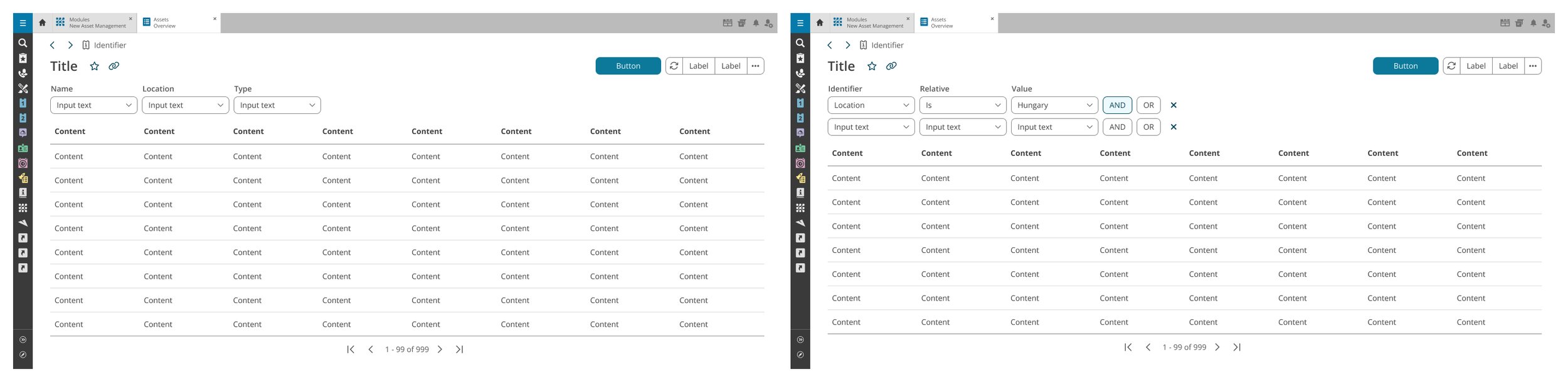
It was fine for the two extremes. Asset Management only ever needed the advanced builder, and Knowledge Base only needed a few options, so both worked. Taskboard was the one that broke it. Taskboard wanted all of it at once: a default set of filters, a custom set the user builds, and quick toggles for fast filtering. The top row just filled up and there was no room left. So the top-down idea only really worked if a module sat at one end of the range, and Taskboard sat in the middle.
The obvious answer was a side panel next to the content. It scales well and everyone knows the pattern. But for a module that only needs three dropdowns for archived state or language, a whole panel felt like too much.
So I stopped trying to pick one layout and went with two states. Small, everyday filtering stays top-down. Heavier custom filtering goes in the side panel. One pattern, two modes, depending on what the module needs.
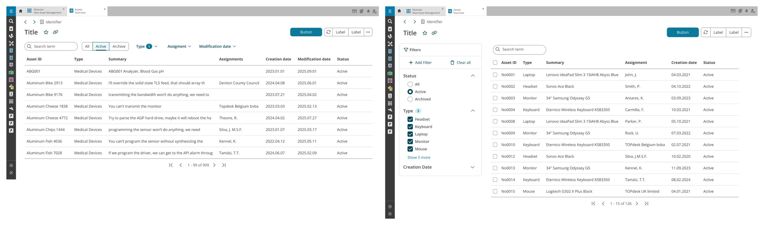
That decision made new problems on both sides.
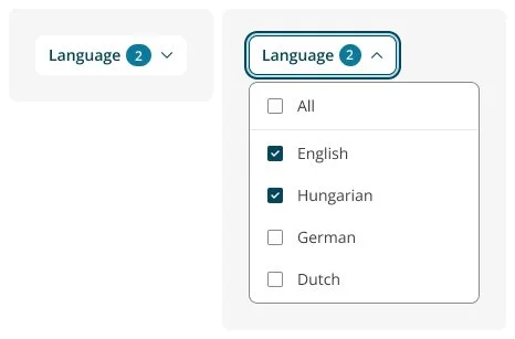
Up top I needed compact single and multi-select controls that didn't exist yet, so I specced two: a dropdown with radio buttons, and one with checkboxes. The label position gave me a little challenge. Accessibility means every filter needs one, and by default the label goes above the field. But sitting above a control that's right next to a search bar with no label, it looked off and ate vertical space. So I put the label inside the control instead similarly how a menu component works. Not "Location" above a dropdown showing "All", but the control itself reading "Location: All".
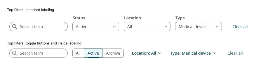
That was fine for single-select. Multi-select didn't fit, because you can't cram multiple selected languages into the control. So for multiple values it shows a number instead, "Language (2)". Same component, just a different way of showing what's picked, and the field name stays there either way.
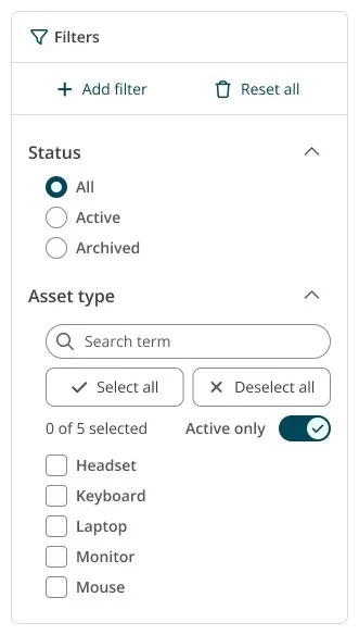
The panel had a different issue. A dropdown up top is fine when you're picking from one list, but the advanced filters are more than that. One filter might have a search field, a select-all switch, a count and the option list, all in one. You can't put that inside a dropdown without breaking accessibility, so the panel uses accordions with listboxes, where every control is its own proper element.
Then space came up again. The panel needs its width while you're setting filters, but once you're done, a dense table wants that room back to actually be readable. My first go collapsed the panel sideways into a thin rail. That still took up space, and it went blank, so you couldn't even tell anything was filtered. I changed it to collapse upwards into a button. The table gets full width, and the button keeps the filter state. When it collapses it turns into the same "Filters" invoker the top bar uses, so the advanced panel, once it's closed, basically looks like simple filtering again.
After that it was just building it. The pattern needed a few components that didn't exist yet, the two top-filter dropdowns and the panel that collapses up into a button with the count on it, so those got built out.
Then the documentation, which is really the whole point. A filter pattern only I understand isn't worth much in a design system. What I wanted was for any designer or developer to come to the docs later, look at their own use case, and build the right filtering off it without needing me there. So I wrote the whole thing up with the detailed specs, when to use each component, how the two states work, what goes where and why.
That part took a few rounds. Back and forth with designers, developers and our accessibility expert, mostly on getting the wording clear enough that it actually made sense to everyone and not just to me. We kept going until everyone was happy with how it read.
The full Global Filtering Case Study is here.
What's next
Saving had been hanging over the whole thing from early on. Setting up your own filter set is only half of it really. If you can't save it, you're just building it again the next day, and a manager can't set one up once for their whole servicedesk team to use. So it mattered.
I left it out on purpose though. The filter pattern was already big, and saving is easily its own project, so trying to squeeze it in here would've meant doing it badly. Better to keep it as the next thing than force it into this one.
And it's the same problem underneath anyway. Saving isn't just a button on the filter set, it's that different teams already do their own thing for saving, which is basically where filtering was before all this. So the next step was never really "saving for filters", it was a saving pattern for the whole product, done the same way as filtering: find where it's a mess, build one thing that works across the cases, roll it out.